

Substack Cover Safe Zone: Fix Cropped Covers
Your Substack cover is being cropped 9 different ways. This post explains the safe zone, gives you the prompt to fix any cover, and includes a Claude skill and Figma and Canva templates.


TL;DR: Substack shows your cover in 9 different placements and crops it differently in each one. I collabed with Karo (Product with Attitude) — she built the Canva and Figma templates, I did the research, wrote the prompt, and built a Claude skill. Before/after proof below, plus a setting in your Substack website editor you've probably never touched. Free subscribers can buy the toolkit and templates. Paid subscribers get it free, link is behind the paywall.
It All Started When The Kid’s Head Went Missing.
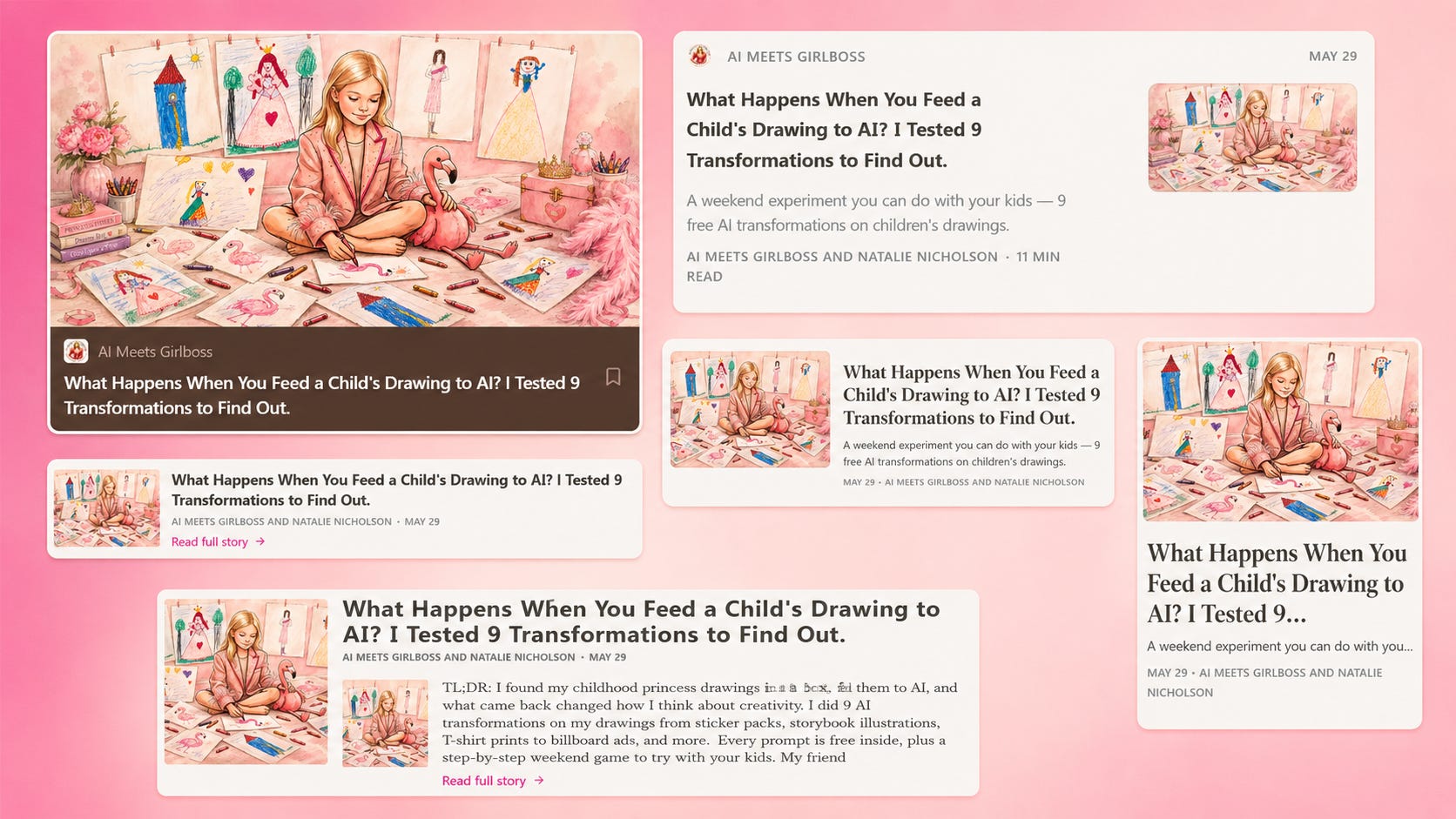
Recently I wrote a post on what happened when I fed my princess drawings from the 90s to AI — and I did what I always do, generated a cover for it in AI. I was really happy with the cover my AI gave me. It showed a little girl, cross-legged on the floor, surrounded by crayons and childhood sketches, the flamingo toy tucked under her arm.
Then I uploaded it to Substack as a cover, hit publish and her head was gone. Ok, her forehead. But still, not really aesthetic.
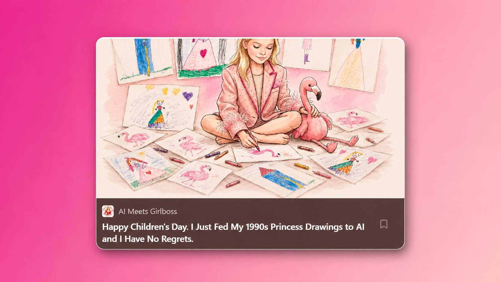
I hadn’t done anything wrong with the image itself. The problem was that I’d generated a beautiful 1200×630 composition without understanding how Substack was going to display it. And Substack only shows a center strip of that canvas.
A day later, totally unknowing of my failure, Karo (Product with Attitude) messaged me saying she was doing research on Substack safe zone sizes and if I was interested in collaborating. Talk about intuition and perfect timing. So I said yes and I did the research on all the Substack display sizes, wrote an image gen prompt and a CLaude skill, and Karo turned it into Canva and Figma templates. Go follow Karo and read her post on Substack cover sizes too!
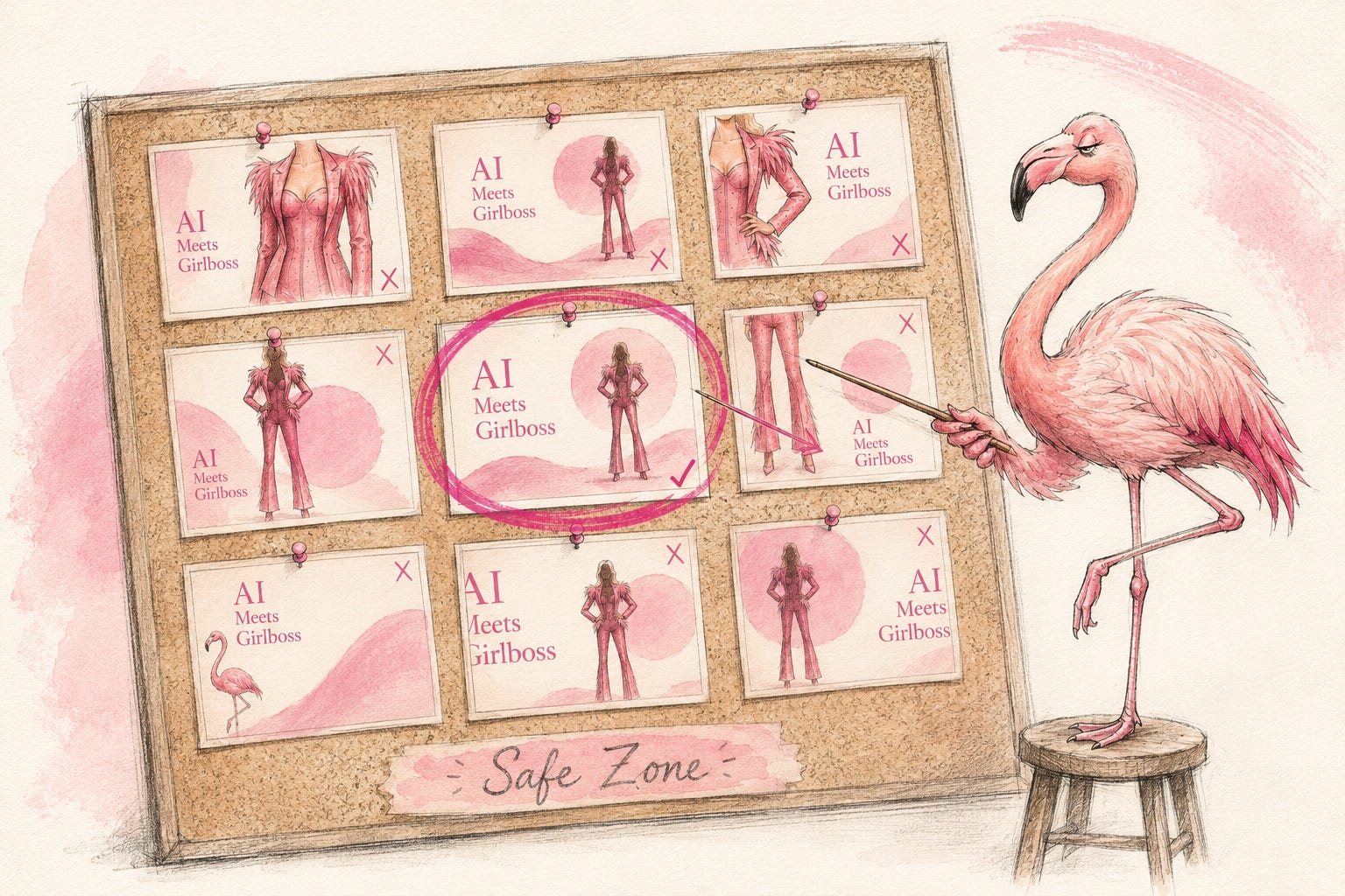
Hey, I’m Pinkie. I help creators build recognizable Substack brands that drive consistent subscriber growth. I share the exact branding systems, prompts, and workflows I use to transform ideas into distinctive, repeatable output. If you’re new to AI Meets Girlboss, welcome! Honestly, this might be the best time to join. start here! 🩷🦩

What you’ll learn in this post:
All the placements your Substack cover appears in, and why it looks broken.
How to fix thumbnail resizing between social media channels (YouTube, Linkedin, Medium and Substack).
Before/after: a cover of mine with a cropped head, and the fixed version.
Diving into the Substack website settings that affect how your cover image shows up.
(Paid) The full placement data, safe zone coordinates, copy-paste prompt, Claude skill by me, and Canva and Figma templates by Karo.

All The Placements Where Your Substack Cover Appears.
The standard Substack cover size is 1200×630 px. What I didn’t realize before Karo (Product with Attitude) kept asking me the right questions, was how many different ways Substack displays that cover.
I did a full deep dive to discover all the places the cover image can show up. To my surprise Substack shows it in nine different placements, including your homepage, within posts, profile pages, archive lists, featured sections. Each one crops your 1200×630 image differently. Some show almost the full canvas. Some show a tiny thumbnail.
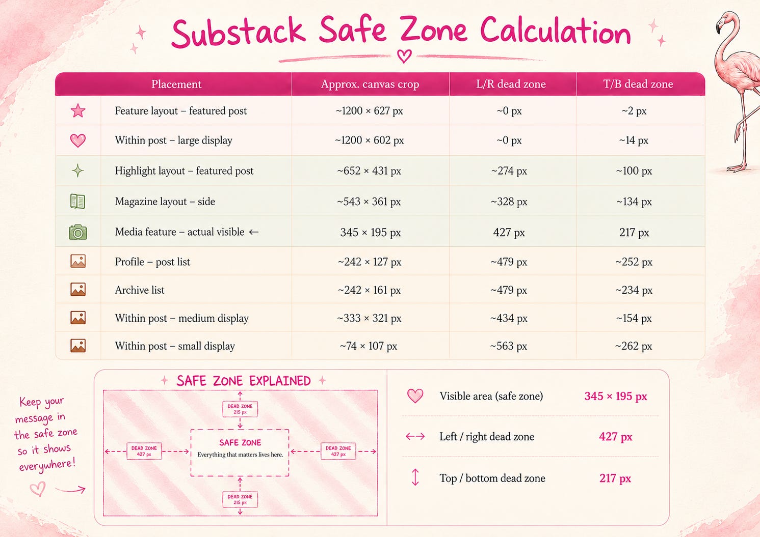
If your face, title, or logo isn’t inside that center rectangle, it disappears in certain placements.
And this isn’t just a Substack problem. If you’ve ever generated a cover for Medium, YouTube, LinkedIn, or your website — and then tried to use that same image on Substack — you’ve already run into this. Different platforms have different safe zones. An image that looks perfect on YouTube (1280×720, center-heavy) will break in Substack.
It's the same headache I hit when I switched from static to video covers — a focal point that holds still falls apart the second it starts moving, and setting one up in the first place has its own version of this exact problem.
The fix? You don’t need a new image, but you do need a prompt or a Figma template that repositions the focal point. That’s what we’re trying to solve today.
What the Substack Cover Image Safe Zone Actually Is.
Karo (Product with Attitude) and I mapped all 9 placements where your cover is most likely to appear on Substack. I built the safe zone logic and the prompt on top of the research. She turned it into Canva and Figma templates you can use directly.
Each placement shows a different portion of your canvas. You know the small preview thumbnail that appears when you link to a post inside your article editor? That’s the tightest crop of all. If your face, title, or logo isn’t inside a very specific center window, it disappears there — and in several other placements too.
On a 1200×630 canvas, the universal safe zone is the center 345×195 px rectangle.
Canvas: 1200 × 630 px
Safe zone: 345 × 195 px, centered
Left/right dead zone: 427 px each side
Top/bottom dead zone: 217 px each side
When I realized what that actually meant, I couldn’t stop laughing at how completely ridiculous the Substack safe zone is. This is what it looks like:
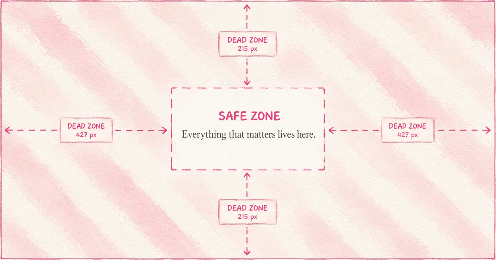
This means your safe zone is a very small part of the image. Everything that’s important, whatever you want readable - text, logo, title, publication name, your character, face, or focal subject - should go into that smallest crop.
Everything else — background, atmosphere, brand texture, decorative elements — can and should be beautiful. It's doing the same job your brand color palette does: setting the mood, not carrying the message. It just can't carry information, because it won't be visible in every placement.
Here’s the version of my cover that went live with the cropped head and this is what it looks like after I ran it through the safe zone Claude skill — regenerated with the focal point anchored correctly.
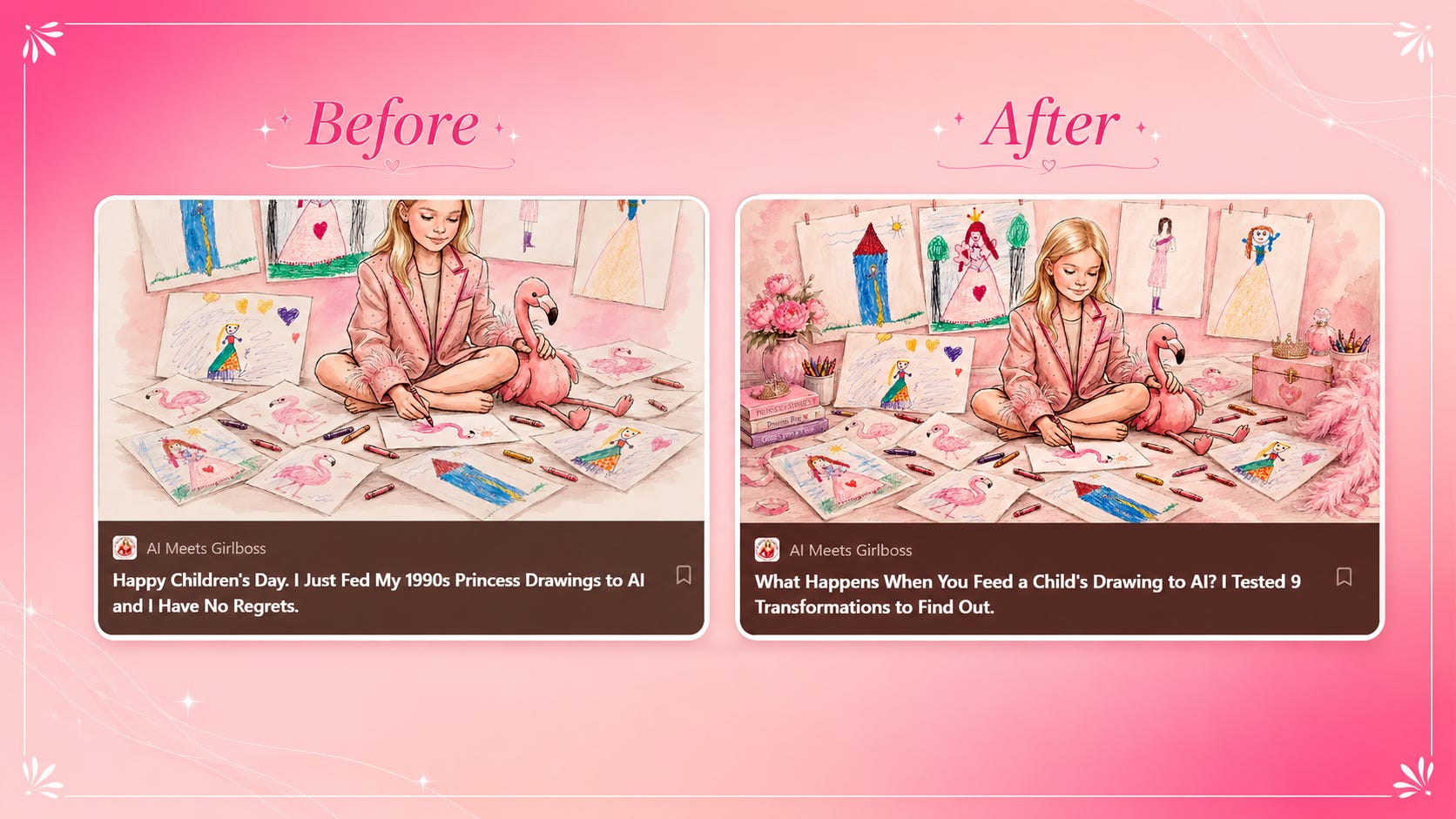
This is the same system Karo (Product with Attitude) and I documented in the full research package — all 9 placements, their crop dimensions, and the Canva/Figma template brief. It’s available as a downloadable toolkit, and I’ll drop the links behind the paywall below. Read Karo’s post here.
The Substack Website Setting That Affects How Your Cover Image Shows Up.
There is a website setting within Substack that help make your covers show up within the safe zones. Go to your Website editor → Hero section → Images → Cropping.
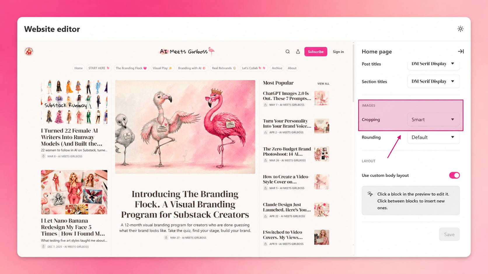
Substack ‘Cropping’ setting has two options: Center and Smart.
Center crops from the dead middle of your canvas every time. Predictable, consistent, mathematical and very much in line with the Substack Safe Zones we just defined above.
Smart tries to detect the most interesting part of the image — a face, a focal object — and crops toward that. It sounds better, and sometimes it is. But Substack decides, not you. And if it reads the image differently than you intended, something important disappears.
Mine was set to Smart, which is why the cover looked fine when AI created it but then totally wrong and forehead-free on the Substack homepage.
Switch to Center and design deliberately. It’s better when you control exactly what shows in every placement.

Check Your Cover Images Right Now.
Here’s the 30-second test.
Go to your Substack homepage, scroll through your Archive page, and look at your cover images.
Is everything important visible? If you have a title on the image, is it readable? Or has the crop swallowed the most important part?
If it looks fine there, you’re probably safe. If something feels off — a cropped head, a missing logo, a subject that’s drifted to the edge — that’s the safe zone problem.
The fix is a prompt and a Figma template. A specific one, built around the safe zone coordinates, that tells the image generator exactly where the focal point needs to land.
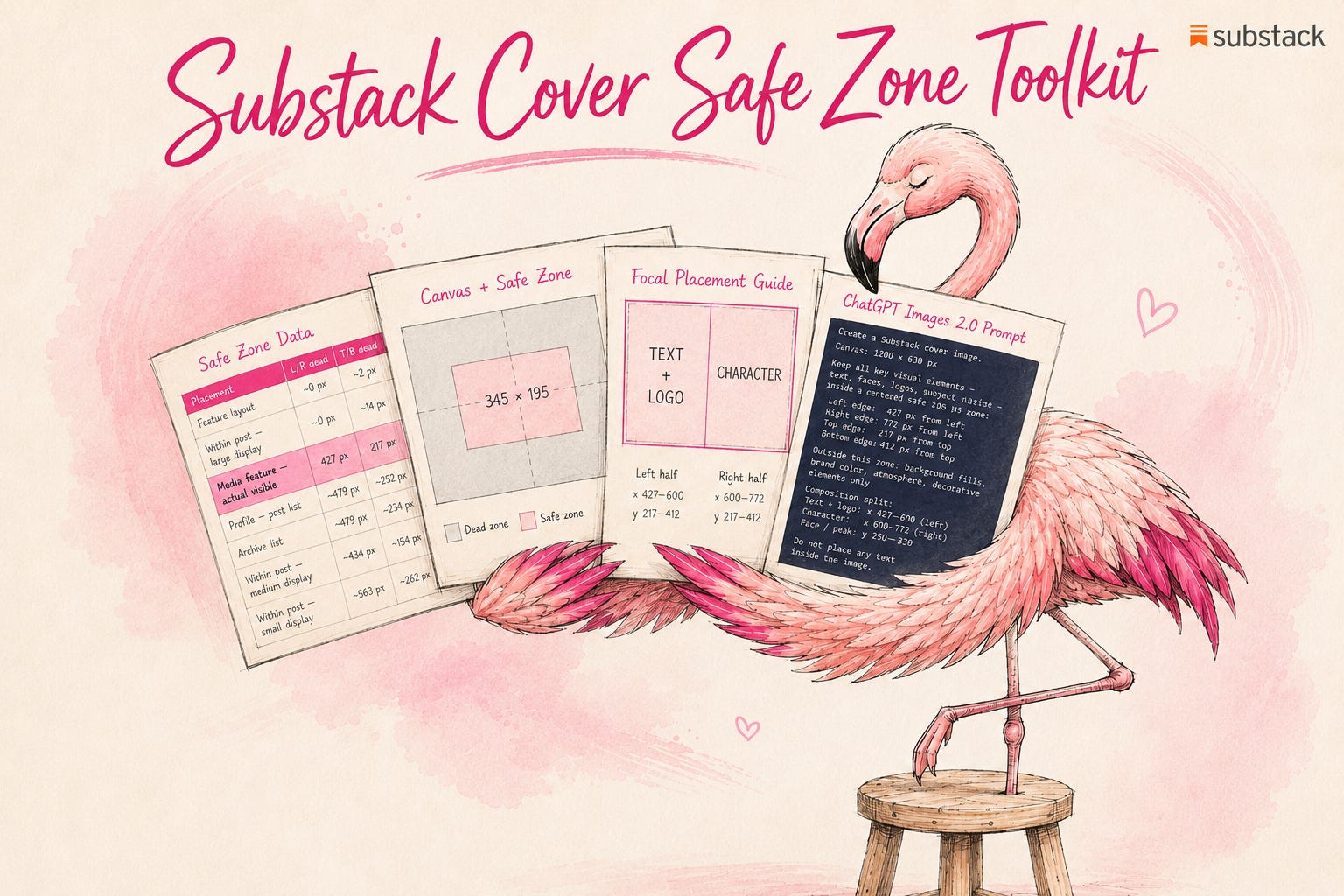
If you want to buy the Safe Zone Toolkit at full price, grab them here:
Or upgrade your subscription to get the AI Meets GIrlboss Safe Zone Toolkit 100% free along with 30+ other branding with AI tools.
In the comments:
Does your current cover pass the safe zone test? Drop your publication handle and I’ll take a look, or just tell me whether yours has ever looked broken in a thumbnail. I want to know how widespread this actually is.
If today’s post made you think about your own visual brand, I am running The Branding Flock, a visual brand & identity program for Substack creators who are done being invisible.
Full breakdown posts, real prompts, real outputs. Your color palette, your logo, your brand character, your content system — built step by step alongside the flock.
25% off your subscription if you are brave enough to look in the mirror, and take the brand maturity test developed by a group of very judgmental flamingos.
Free download link for Branding Flock members:

 | A guest post by
|