


This post is part of The Branding Flock paid series. We're building a complete visual brand system from scratch, step by step, using AI tools. We’ve covered logos and brand reference sheets. Check out the full series archive here.
TL;DR: Your brand colors are doing psychological work every time someone lands on your page. Most Substack creators pick them based on what they like instead of what they need to say. This post breaks down the research behind why color works the way it does and helps you find your direction — then, for paid subscribers, the full build: palette ratios, all four color schemes with hex codes, the Substack-specific contrast rules nobody tells you, and a Claude skill that builds your complete palette.
Why Did I Decide On Pink For My Substack?
Ok, storytime. Before AI Meets Girlboss was pink, it almost wasn’t. I sat with hot pink for two weeks before I let myself commit to it. Not because I didn’t like it. Because I was scared of what it said about me.
Pink felt soft. Decorative. Like the color version of not being taken seriously in a room full of people who default to navy and charcoal when they want to signal “serious brand about AI.”
I kept asking myself: can a brand about systems, strategy, and AI actually wear hot pink and still be credible?
Here’s what changed my mind. I stopped asking “do I like this color” and started asking “what does this color need to say about me.”
Hot pink doesn’t say soft. In the right system, it says confident, daring, impossible to ignore in a feed full of beige. That’s a documented psychological response — people physically respond differently to high-energy colors like hot pink and red than to muted or cool tones. Once I understood the research behind it, picking pink stopped being a risk and started being a decision.
Hey, I’m Pinkie. I help creators build recognizable Substack brands that drive consistent subscriber growth. I share the exact branding systems, prompts, and workflows I use to transform ideas into distinctive, repeatable output. If you’re new to AI Meets Girlboss, welcome! This might be the best time to join. start here! 🩷🦩
What You’ll Learn In This Post.
Why color is doing psychological work on your readers before they read a single word
What each color actually signals (backed by research, not opinions)
A free 2-minute test to find your brand’s color direction
(Paid) How many colors do you need for your Substack brand?
(Paid) The color wheel, and how to work with the spectrum.
(Paid) Four color scheme design rules that work, and help build your color system
(Paid) The Brand Color Prompt for Claude or ChatGPT that builds your complete palette
Heads up, Girlbosses: starting today, monthly access to the Branding Flock moves from $8 to $15. If you’ve been circling annual, this is the window — 20% off through July 4.

Color Is Not Decoration. It’s a Communication Decision.
Most Substack creators treat brand colors like a decoration choice. Pick something you like, make sure it’s not ugly, move on.
The problem with that is your readers aren’t neutral. They’re processing your visual brand before they’ve read a word, and color is the first signal they receive. Research in color-brand psychology consistently shows that when a brand’s visual identity matches the personality it’s trying to communicate, trust and recognition go up. When they don’t match, something feels off — even if the reader can’t name why.
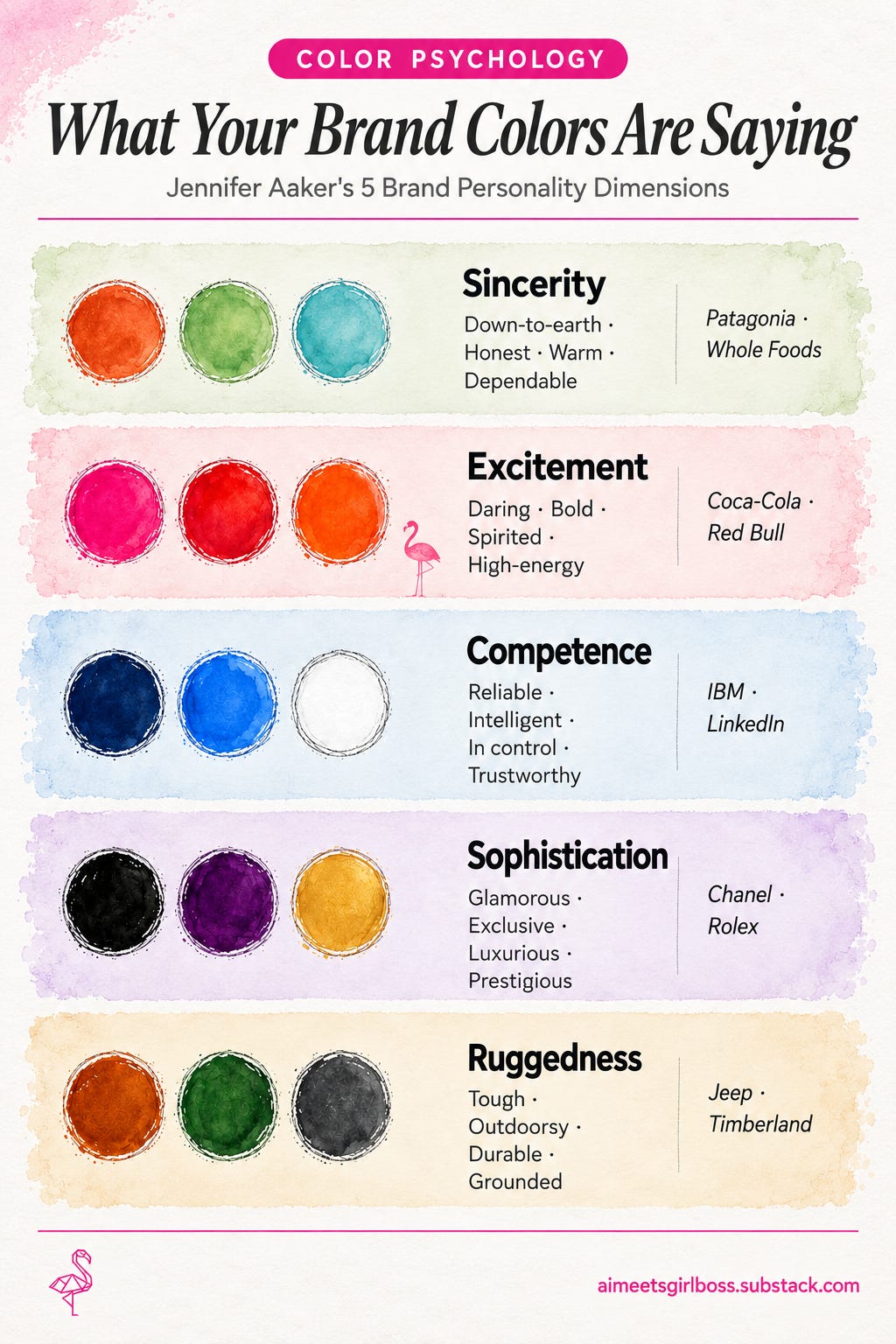
There’s an academic framework that maps this directly. Marketing researcher Jennifer Aaker, now a professor at Stanford’s Graduate School of Business, developed a model identifying five measurable dimensions of brand personality — Sincerity, Excitement, Competence, Sophistication, and Ruggedness.
Later research by Labrecque and Milne connected those five dimensions to specific color profiles, establishing that color isn’t just aesthetic preference. It’s a personality signal your brand is broadcasting whether you’ve thought about it or not.
The practical takeaway: your brand color should match your brand personality, not your personal taste.
What Each Color Actually Says.
Here’s the map. Every color listed below has documented psychological associations backed by both consumer behavior research and the Aaker dimension framework. This is not “yellow is cheerful because it feels sunny.” These are patterns verified across studies.
Hot Pink | Vibrant Red | Bright Orange
Signal: Excitement. Daring, bold, spirited, energetic.
These are high-wavelength colors that physically increase alertness and urgency. Brands using these are saying: we are impossible to ignore and we know it.
Examples: Coca-Cola, Red Bull, Nickelodeon, Barbie.
Soft Blue | Sage Green | Warm Beige | Earth Tones
Signal: Sincerity. Down-to-earth, honest, warm, dependable.
These colors borrow their credibility from nature — they read as real rather than performative.
Examples: Patagonia, Whole Foods, most wellness brands.
Navy | Deep Corporate Blue | White
Signal: Competence. Reliable, intelligent, in control.
Blue is universally linked to institutional trust. If your brand needs to communicate authority before anything else.
Examples: IBM, Chase Bank, LinkedIn.
Deep Purple | Metallic Gold or Silver | Black
Signal: Sophistication. Glamorous, exclusive, expensive-feeling.
These colors have the longest cultural association with status and luxury.
Examples: Chanel, Rolex, Tiffany & Co.
Dark Brown | Forest Green | Charcoal
Signal: Ruggedness. Tough, outdoorsy, built to last.
These colors borrow credibility from stone, wood, and earth. Durability before style.
Examples: Jeep, Timberland, Caterpillar.
Where does AI Meets Girlboss sit?
My brand, AI Meets Girlboss sits firmly in Excitement (hot pink), with a Sincerity (blush pink) undertone (the I-show-my-receipts, big-sister energy). That’s why hot pink works for a brand teaching AI strategy, and why a soft muted palette never would have. The color is confirming a brand personality.
The same logic I used to choose pink is what I used to build my full voice system. I wrote about that process in the post below. Colors and voice are the same problem, just in different form.


Quick Test: Find Your Direction.
This takes two minutes. Copy this into any Claude or ChatGPT conversation:
I'm trying to identify my brand's color direction for my Substack.

My brand in 3 adjectives: [fill in]
My audience in one sentence: [fill in]
One brand I admire visually: [fill in]

Based on Jennifer Aaker's five brand personality dimensions
(Sincerity, Excitement, Competence, Sophistication, Ruggedness),
tell me which ONE dimension fits my brand most closely, and why. Then suggest a primary and seconday color for my brand with HEX codes.
That tells you your dimension. It doesn’t tell you your palette, your ratios, or how any of it will actually render on Substack. That’s the part most people get wrong, and it’s the part that’s actually hard to get right without seeing it done.
In the notes & comments…
Share what dimension your brand is: Sincerity, Excitement, Competence, Sophistication, or Ruggedness? Share your color palettes in the notes by tagging me, I love seeing what the community creates + I’ll restack you.
Paywall Preview: What The Brand Colors Prompt Output Looks Like.
I built the Brand Colors Prompt to create color scheme options that match your brand personality. I always make sure the prompts I create are tested, so I tested it on two Front Row clients before this post went live.
Both Badass Women in AI and Adrienne Schutte are in the process of building their visual identities on Substack with me as Front Row clients, follow their publications to see their transformation journeys.
Here’s what came out.
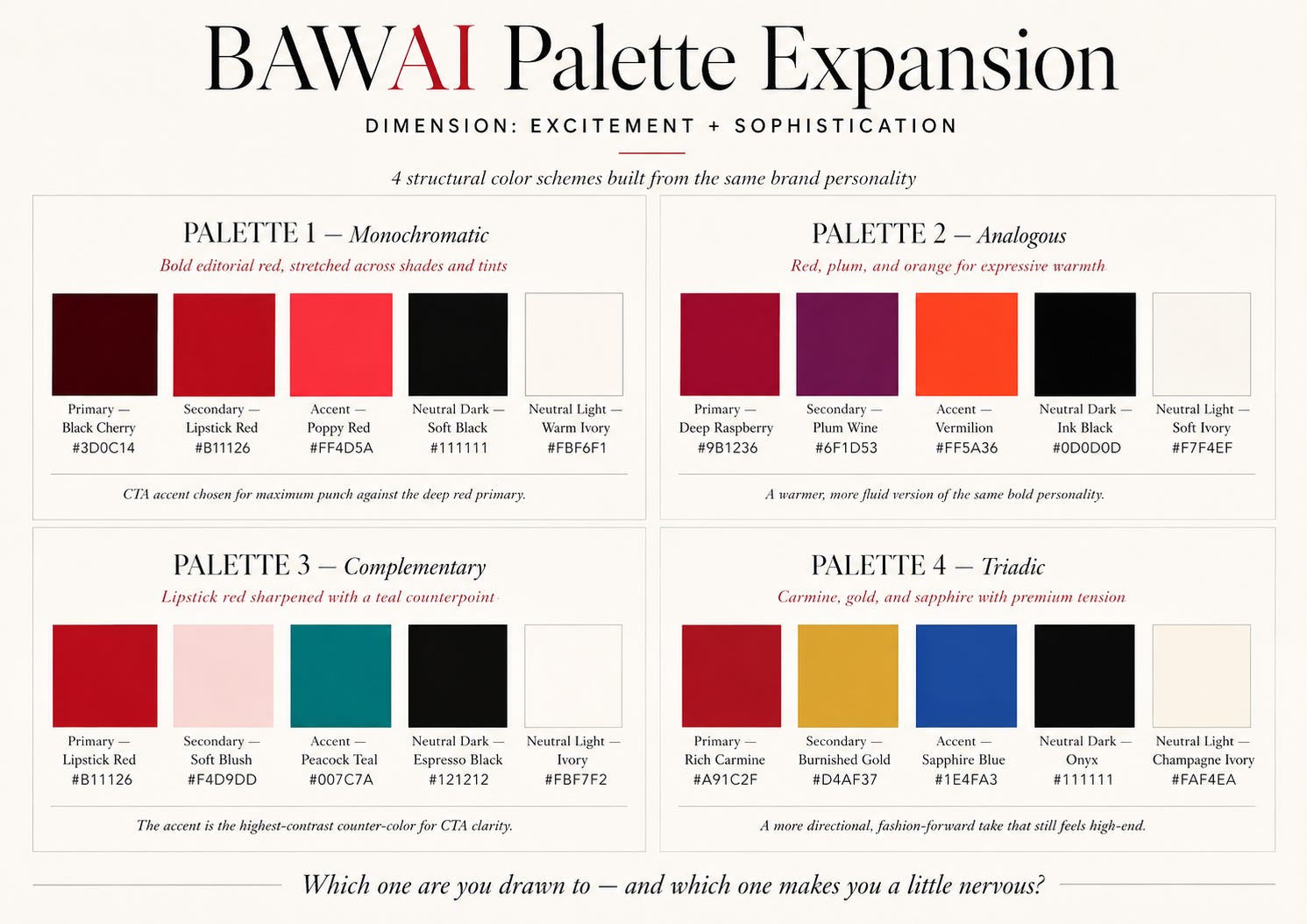
Badass Women in AI (BAWAI) by Lacy Goodwyn
Badass Women in AI’s brand personality is: Excitement + Sophistication. It has a bold, unapologetic energy; editorial authority; the red is kicking the door open. The palette the prompt built was built around deep lipstick red as the primary, with four scheme variations so Lacy could see the same personality expressed four different ways.
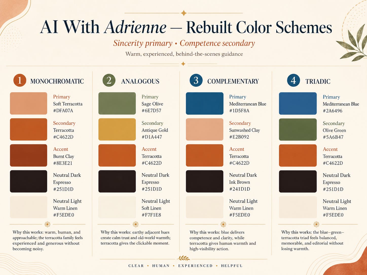
AI With Adrienne by Adrienne Schutte
Adrienne Schutte’s brand personality is: Sincerity + Competence. Her brand centers around her strong personal brand. Her existing palette was warm ivory, camel, olive, espresso, Mediterranean blue — good colors, genuinely her brand personality, but all at equal visual weight. The prompt’s verdict was too many colors getting equal airtime, so the eye didn’t know what mattered first. Then it rebuilt the hierarchy so Adrienne.
What you’ll get behind the paywall:
(Paid) How many colors do you need for your Substack brand? The full ratio system.
(Paid) The Color Wheel and how to work with the spectrum.
(Paid) Four color scheme design rules that work (Monochromatic, Analogous, Complementary, Triadic), and help build your color system
(Paid) The full Brand Colors Prompt for Claude or ChatGPT that builds your complete palette and gives you 2-3 options